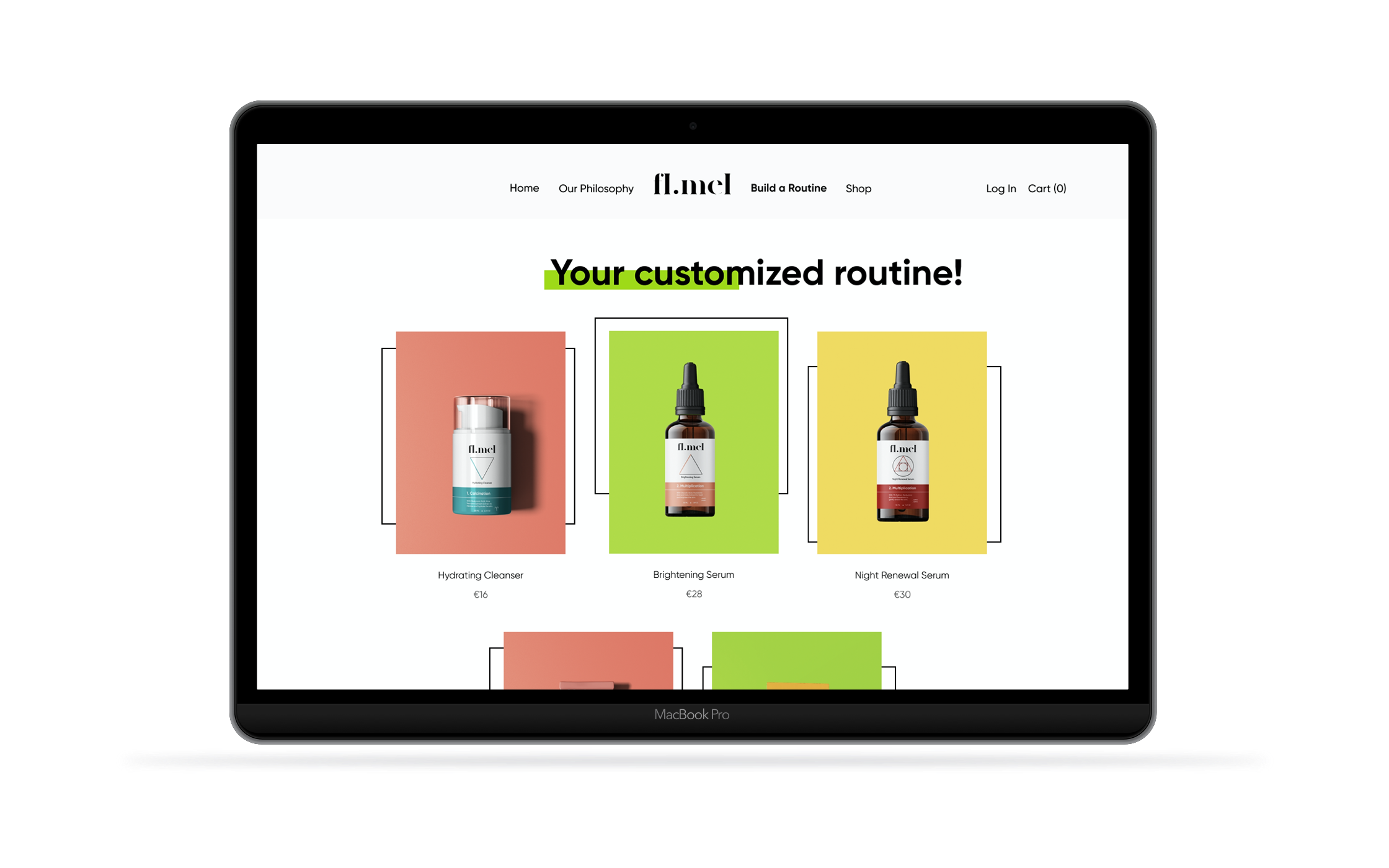
fl.mel
I.
Understanding the Context
After creating the brand identity for a skin care brand of my own invention I set out to design a digital presence for it: it’s own website. Downbelow is the process by which I arrived at the High Fidelity MvPs.
Taking Inspiration from the Brand
Using the work done at the branding stage of the project as the basis, a visual identity for the website was created. It became apparent rather quickly that it had to be both complementary to as well as distinctive from the brand itself as to not confuse or overcrowd the UI.
“I wish it was easier to buy from smaller companies. I very often want to find new products but it isn’t easy to get them delivered where I live.”
How Might We Statements
How might we
capture the essence of the brand and its values, adapting them to a web presence?
How might we
encourage customers to buy more than just one product?
How might we
simplify the choice of products for our potential customers?
II.
Wireframing & Iterating
A strong base is an essential part of any good design, thus a series of wireframes were created and tested to find, not only the right visual composition, but also the best way to structure the information and organise the carts and sections.
III.
Visual Identity
fl-mel takes inspiration from the philosophy and aesthetics of alchemy, making its approach to skin care fun and inviting. These elements had to remain present in the website which is why bright colors (which allude to the use of precious stones and metals in alchemy) and bold typefaces were favoured as it helped present a youthful, millennial front.
Typography & Colour
Grid
I chose to work with a grid consisting of 12 80px columns with 24 px gutters and a margin of 102px to help guide the design and thus make it clean, spaced and easier for programers to work with.
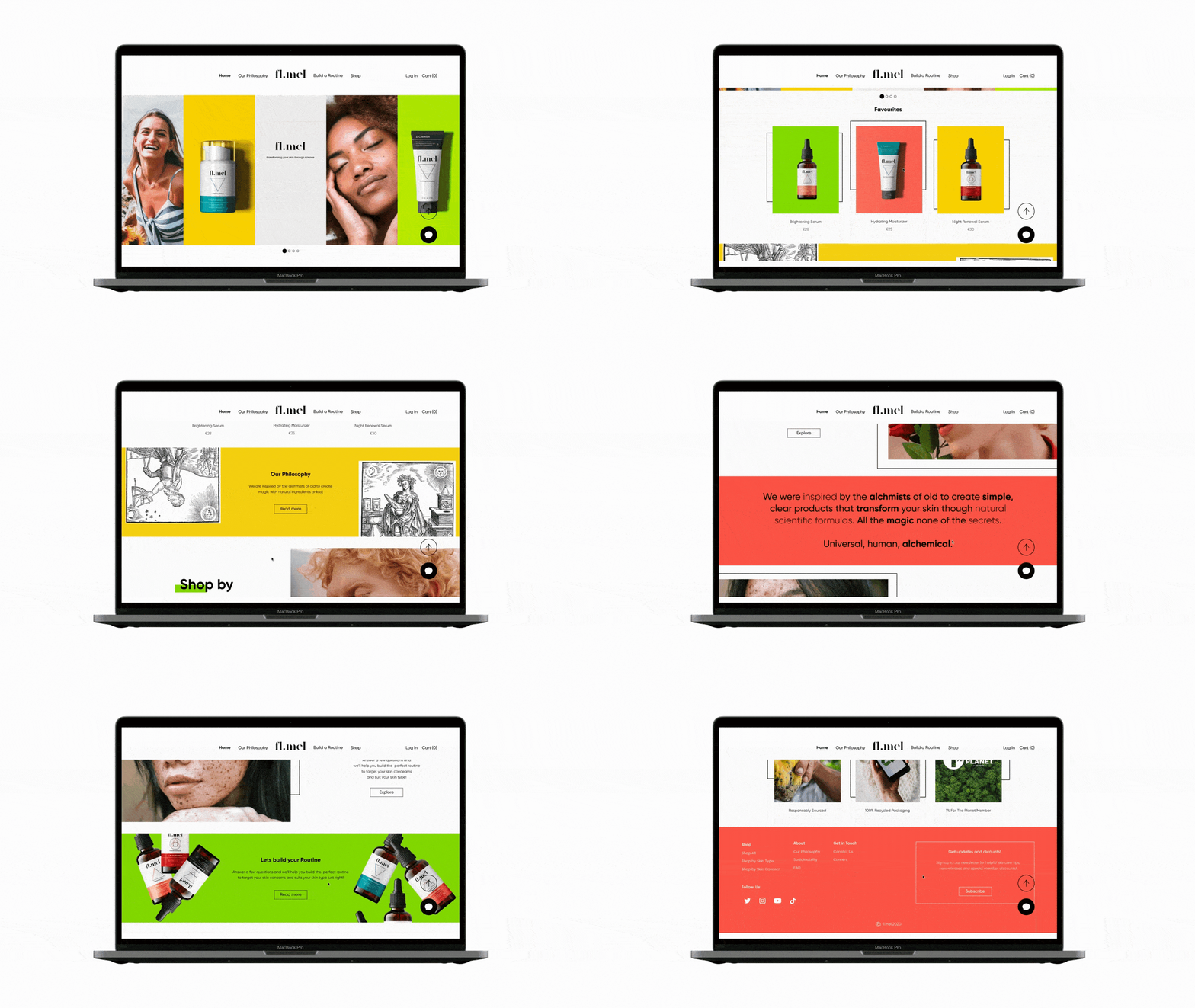
Navigating the Home
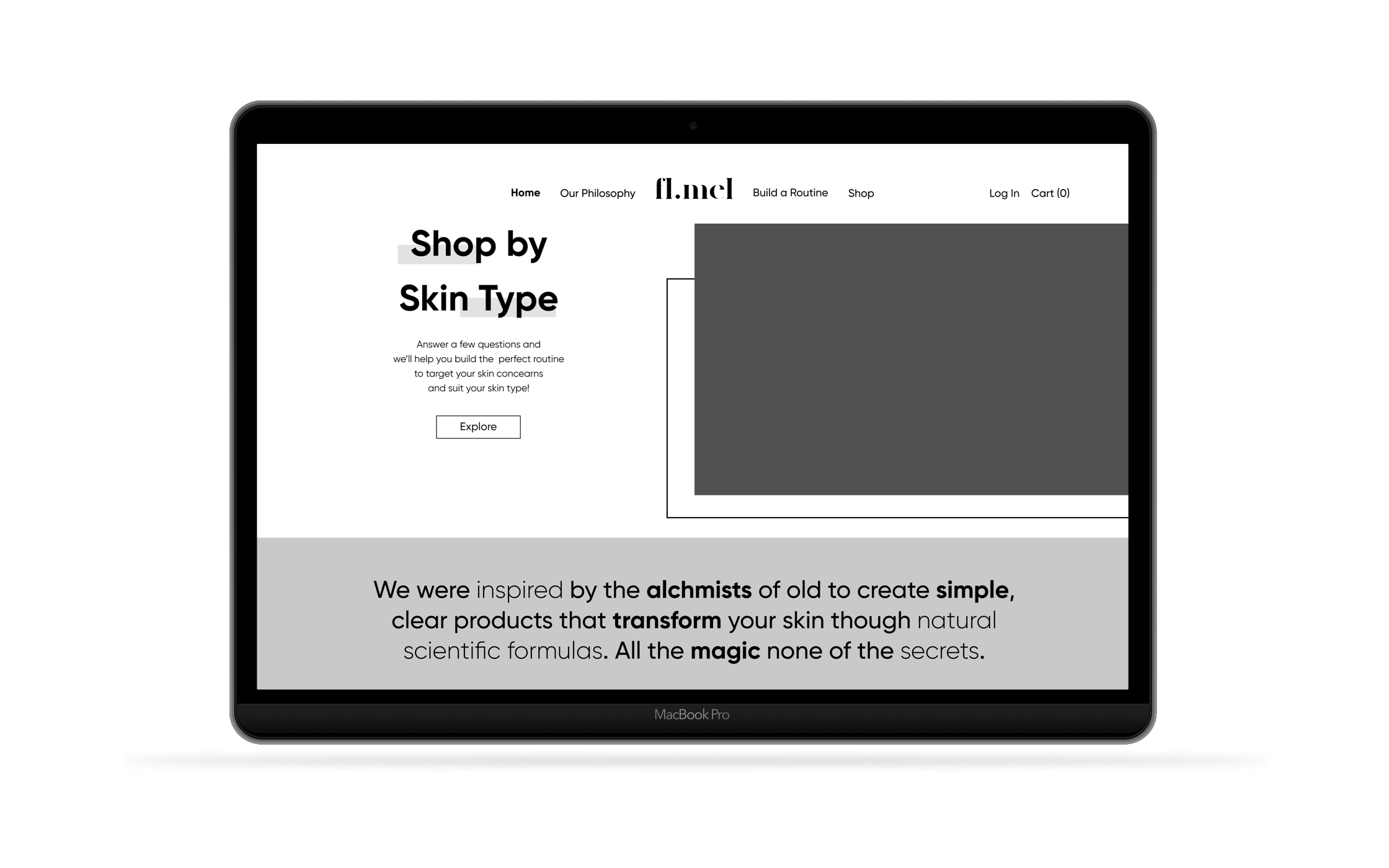
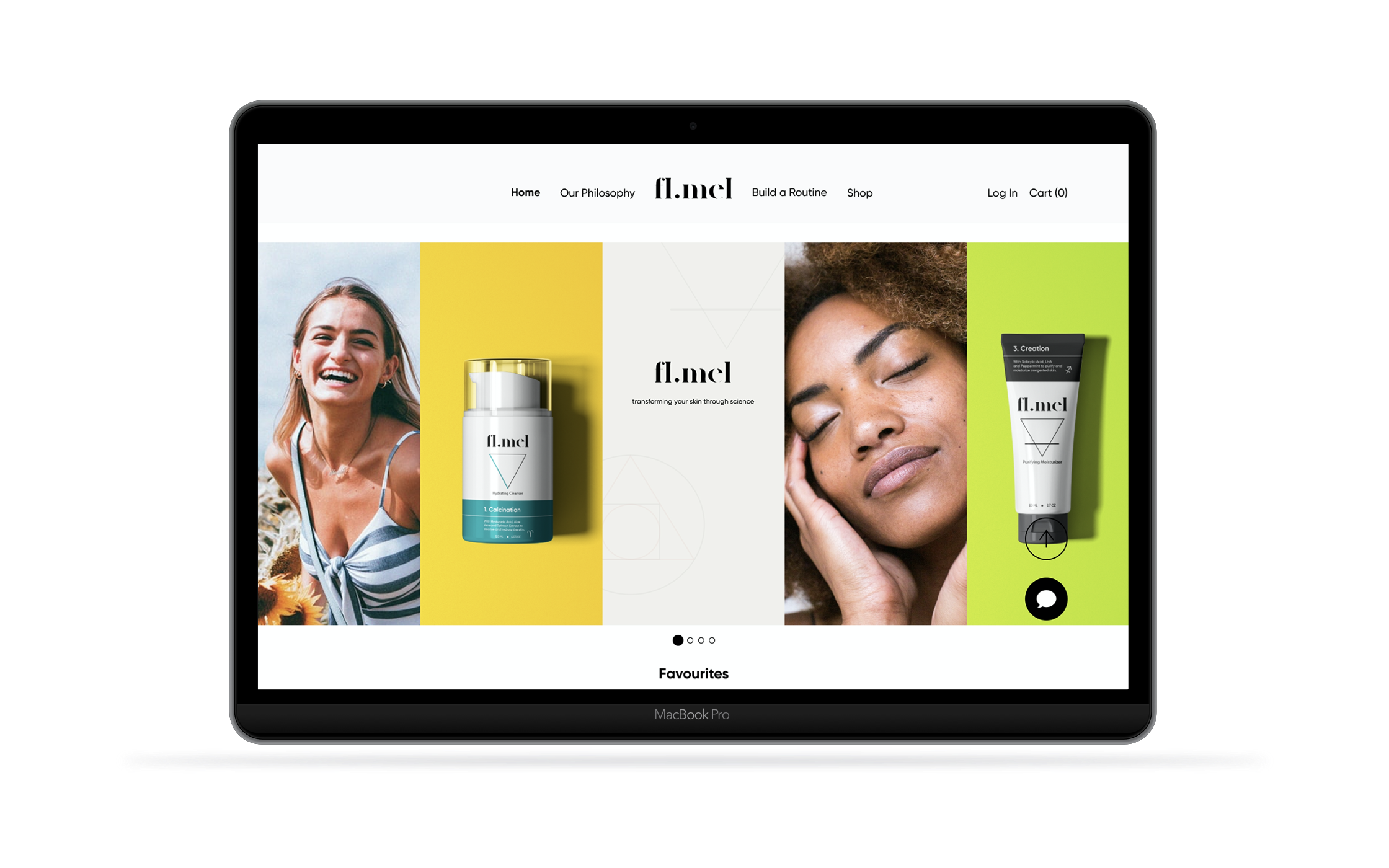
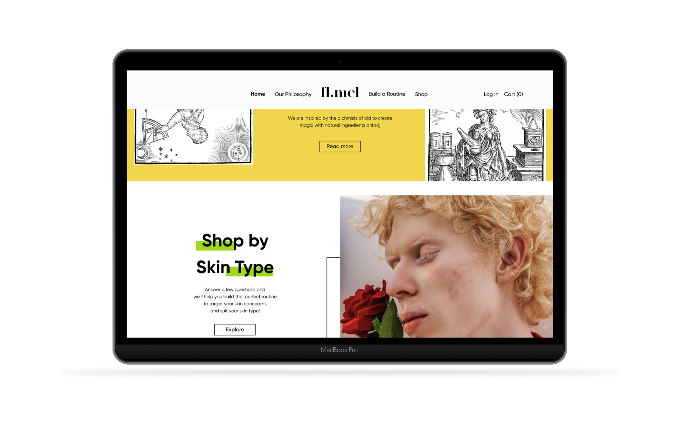
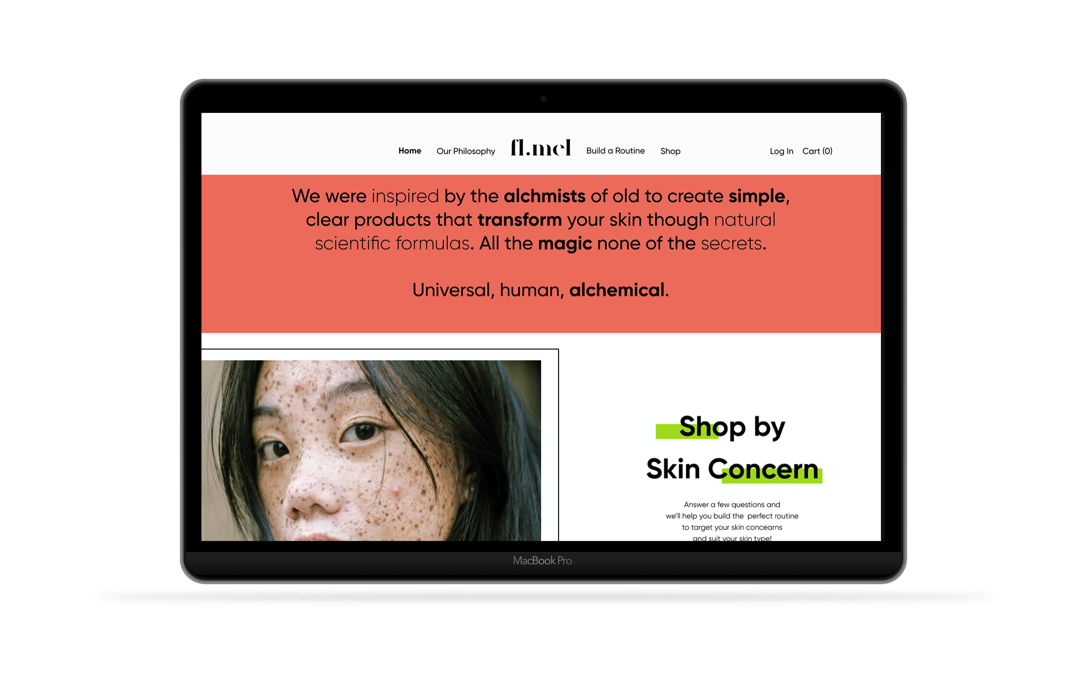
The key for any website is its home. It's the make or break for any e-commerce and as such it must represent the brand clearly and in an inviting way.
To best design the home I created a list of items which were then prioritized to decide which ones made the cut and which ones didn’t. It was paramount to offer the clients a quick view of some of the products so as to encourage potential buying as well as highlighting the brands values and their “routine maker” functionality.
Showing your Business
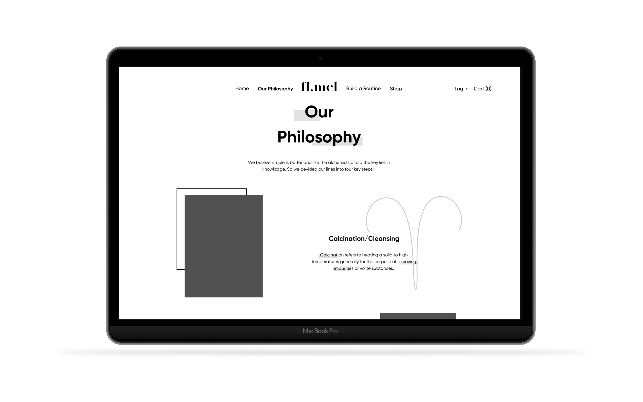
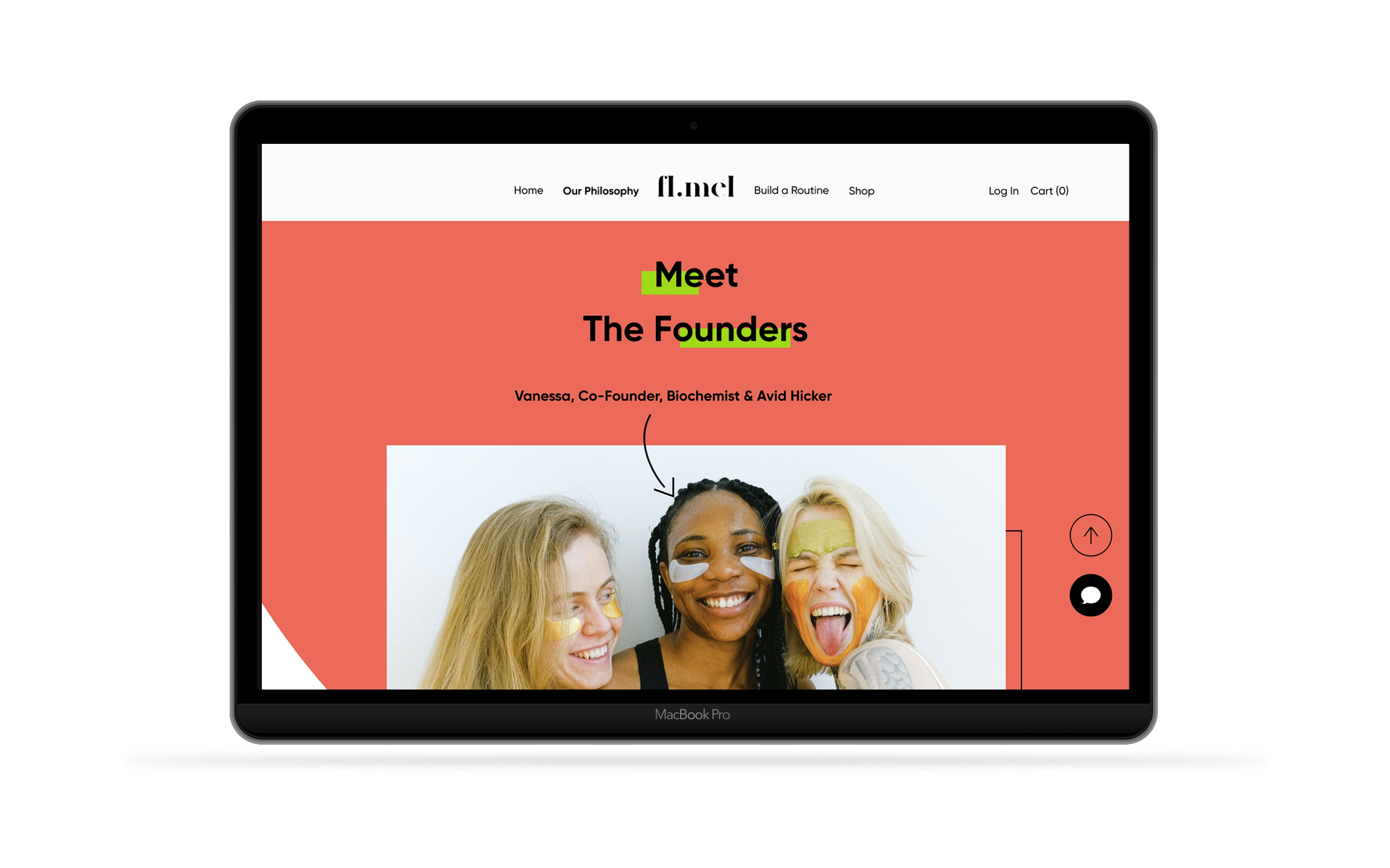
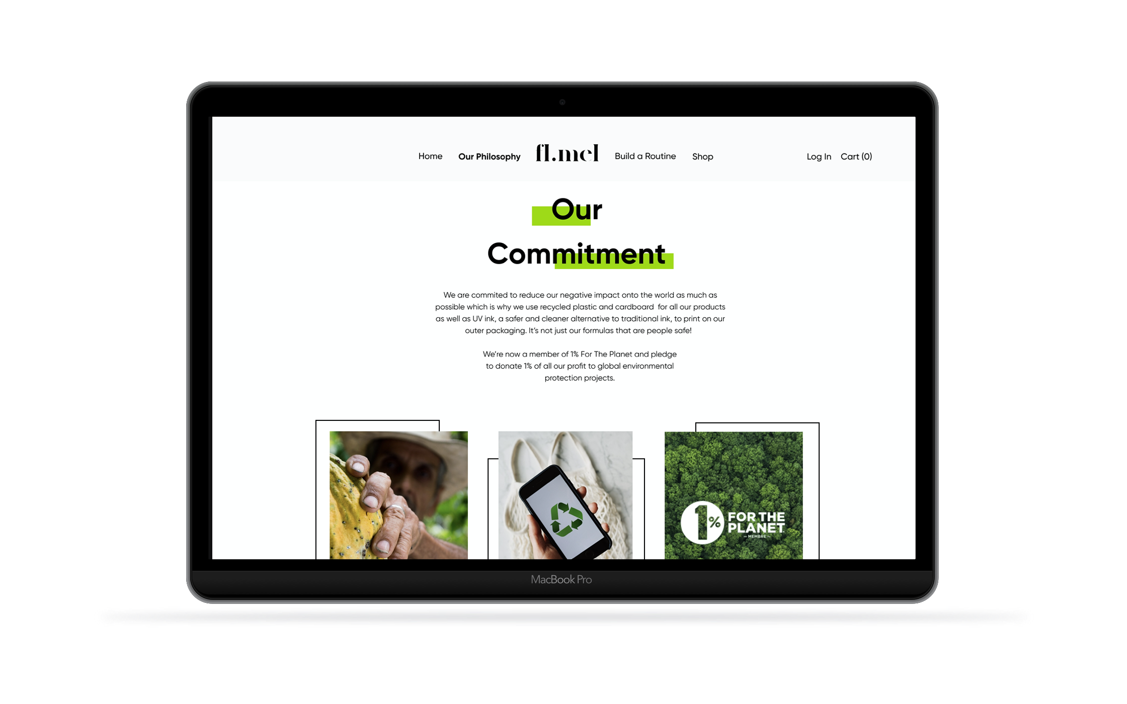
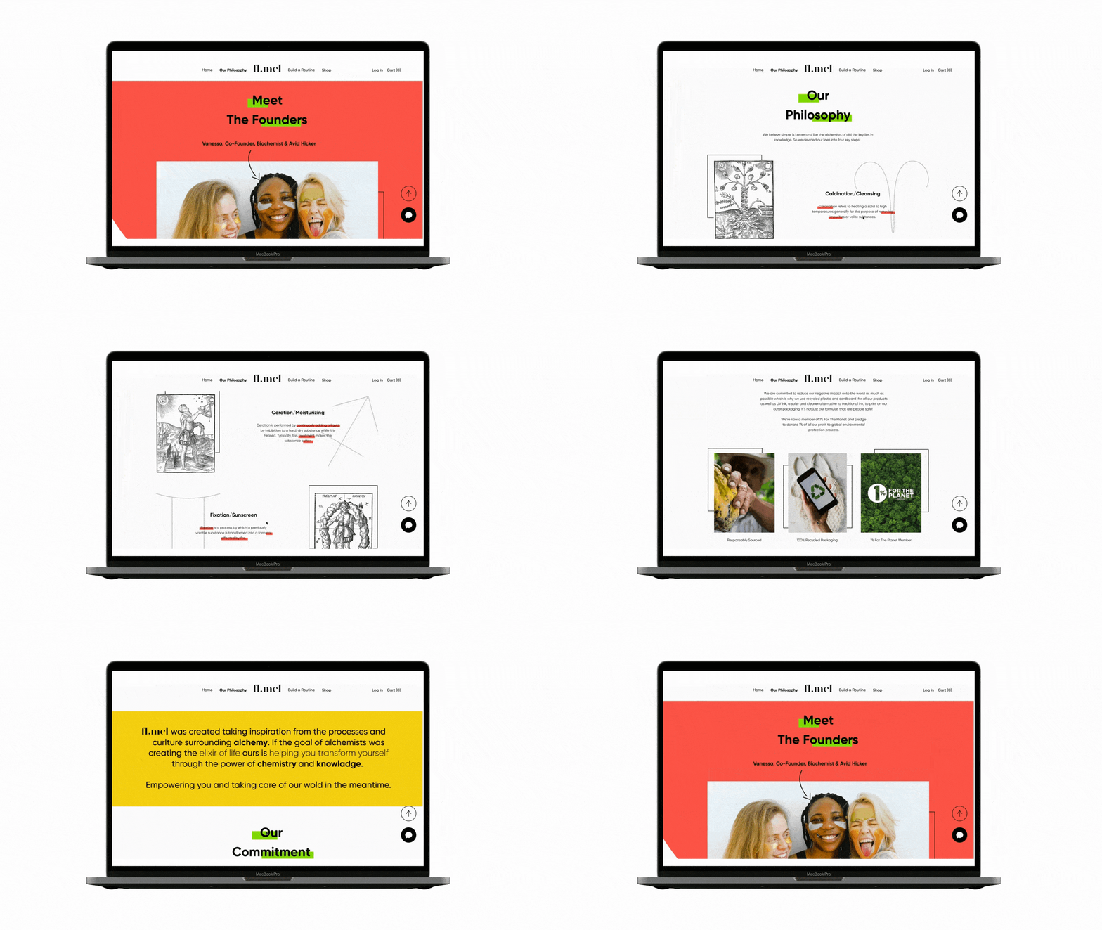
Another key aspect of any company is it’s about page, especially so when the brand has a strong history and ethos. For the section of the website I chose to highlight the founders as they gave credence to the brand as well as its basis in alchemy.
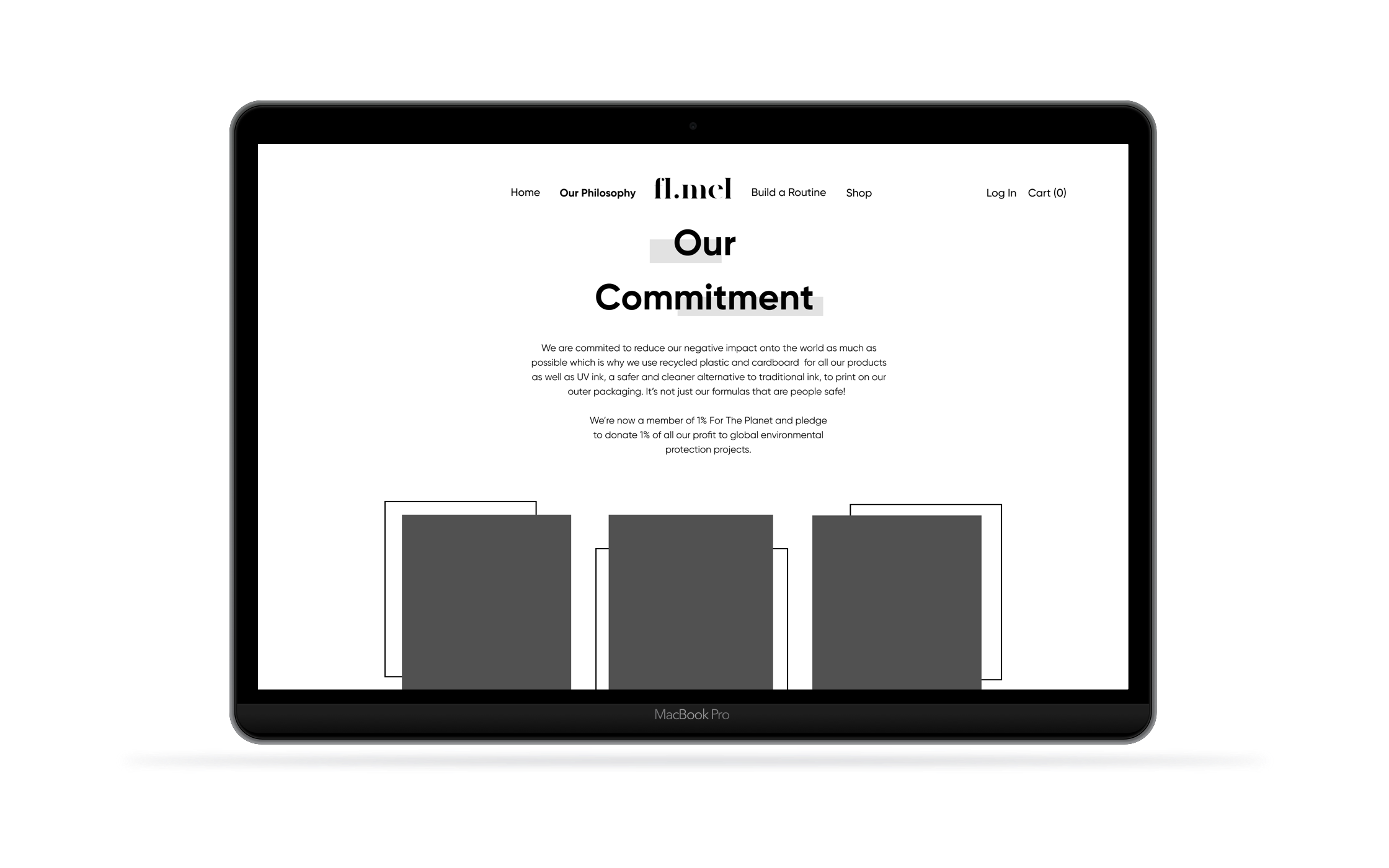
Last but not least the environmental focus was brought forward as it helped make the brand stand out.
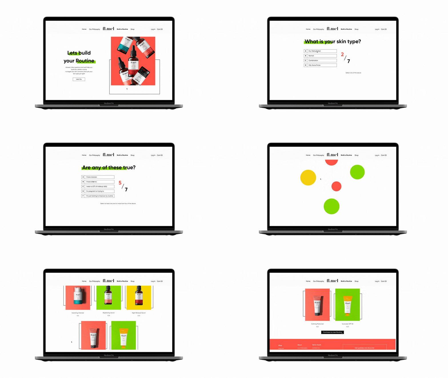
Creating a tailormade Routine
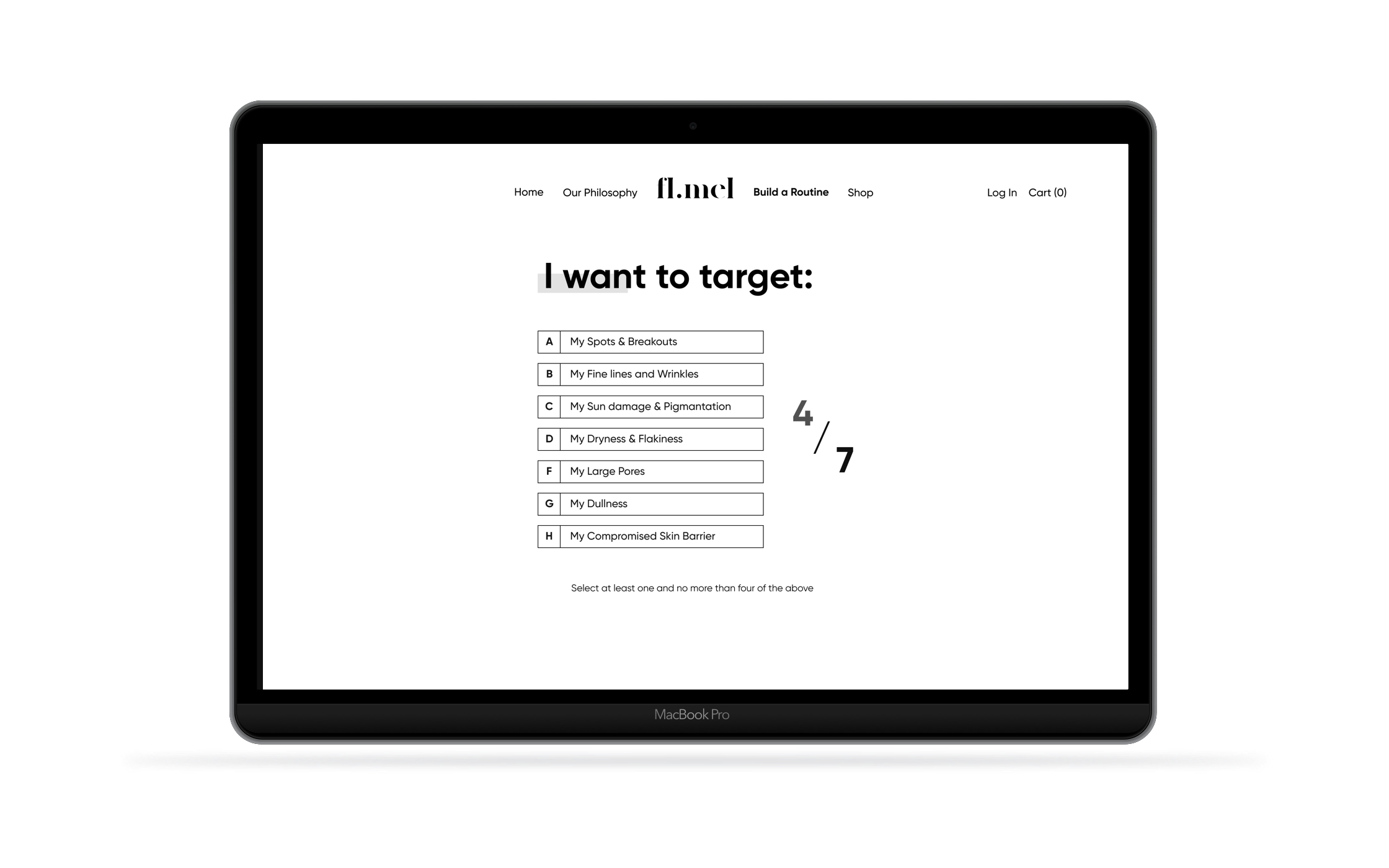
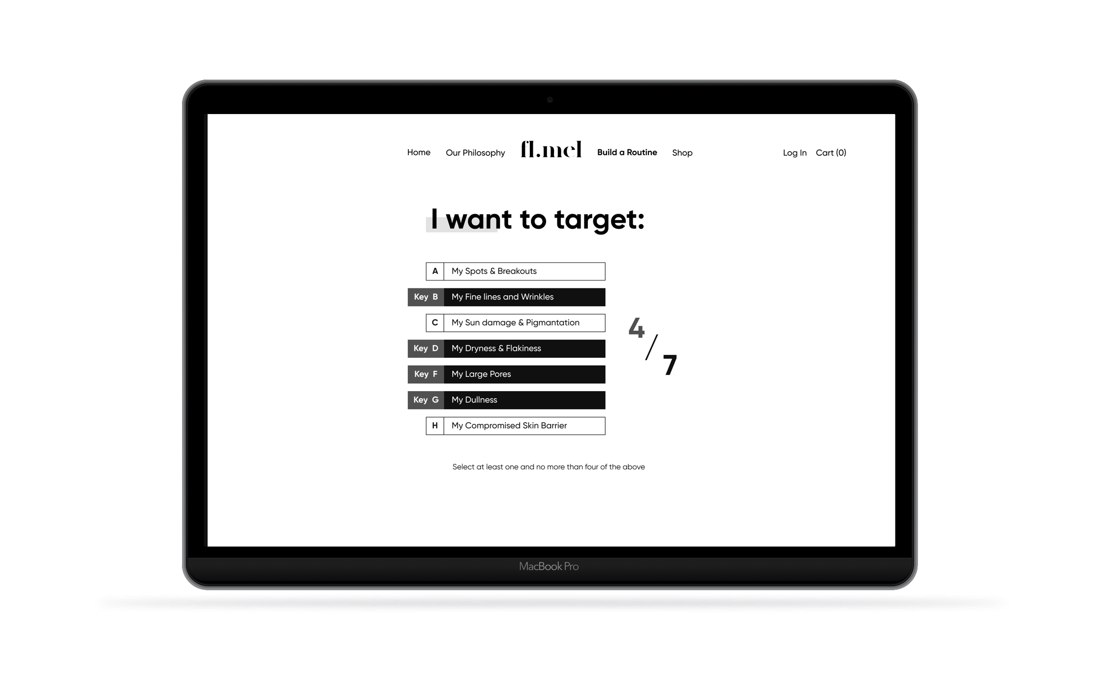
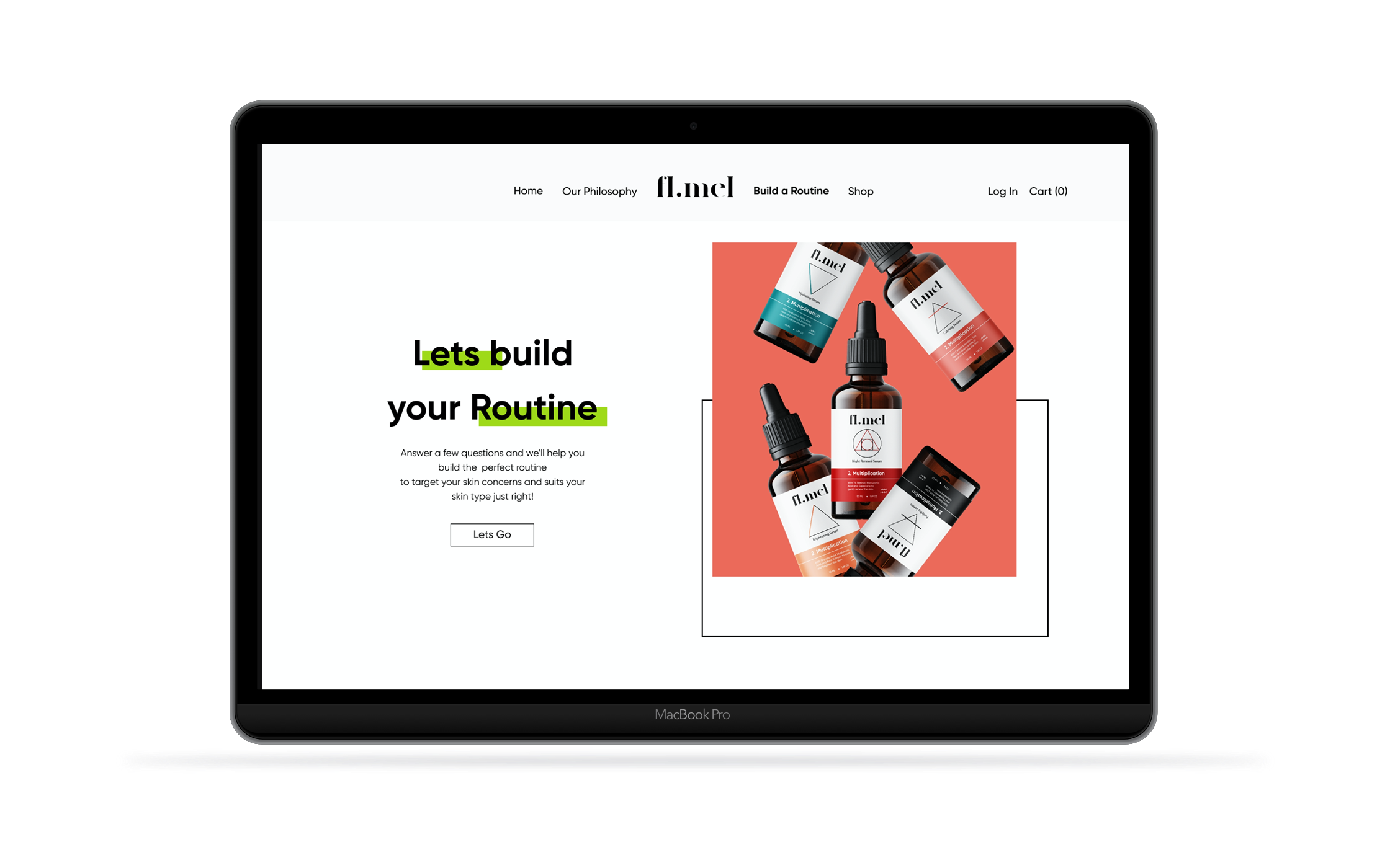
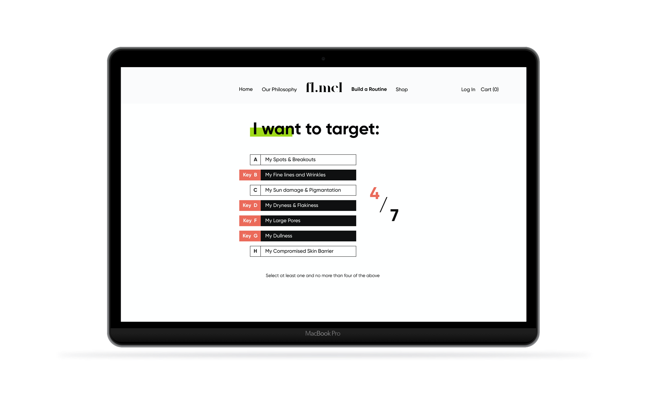
Finally I want to show the flow of one of the main functionalities of the website, and a big potential for sales increase; “the build a routine” section. Here we ask our users to answer a few simple questions, providing constant feedback, to help them get a customized skin care routine. At the end the user can choose to buy any single product or take advantage of the “Purchase my new Routine” button and have all the products immediately added to their shopping cart.
IV.
Conclusion
Adapting an existing brand to a new ecosystem proved challenging but quite a lot of fun. Creating an online presence within certain constraints was extremely inspiring and definitely something I’d love to keep doing.


