WeCare
I.
Understanding the Context
WeCare is the result of new skills applied to an old problem. My family, like many families, had to go through the very difficult experience of caring for a loved one who was becoming more and more ill as the years passed by. It was one of the most difficult times of my life as I was young and technology wasn’t catching up fast enough to our needs.
Now, older and more skilled, I set out to create the app that would have helped us all those years ago.
Competitive Analysis
The Competitive Analysis helped identify the echosystem the product would live in as well as what the streangth and weaknesses of it's competitors are.
“I sometimes feel everything falls back on me, that if I fail everything crumbles down to pieces. Both my parents depend on me and I know they feel ashamed of it. My sister doesn’t live in the same city as us so I can’t ask for much help.”
How Might We Statements
How might we
help users take better care of the medical needs and emergencies of their loved ones and feel more in control?
How might we
help bridge the gap between the elders and their families so they can ask for help easier and feel more supported?
How might we
help our users organise themselves and distribute tasks better within their close circle?
How might we
provide help and ease of mind in case of an emergency?
II.
Wireframing & Features
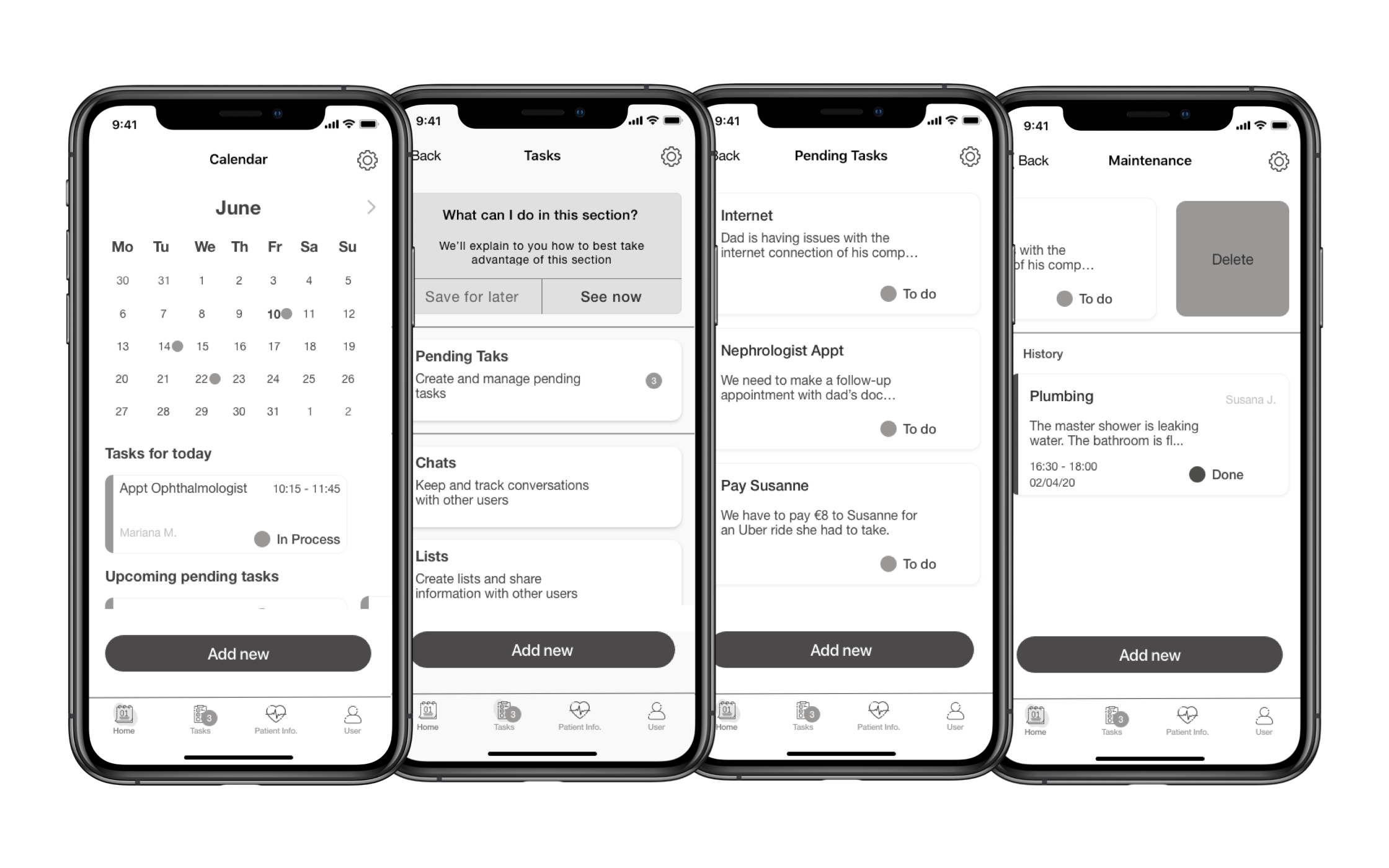
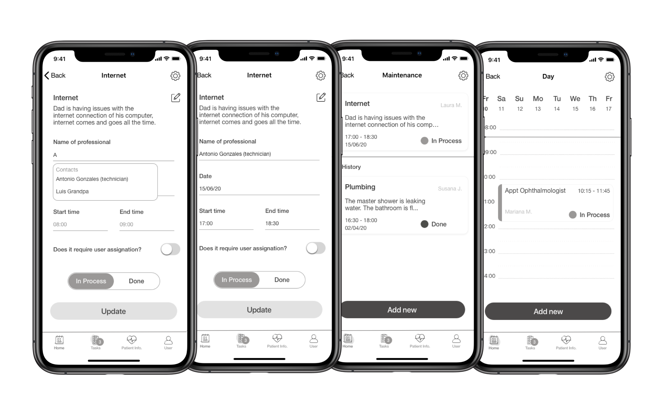
A wireframe was designed to create a basic structure and test the information architecture. The first iteration of the wireframe was made on a low fidelity capacity to test first concepts and ideas quickly and without paying too much attention to the UI.
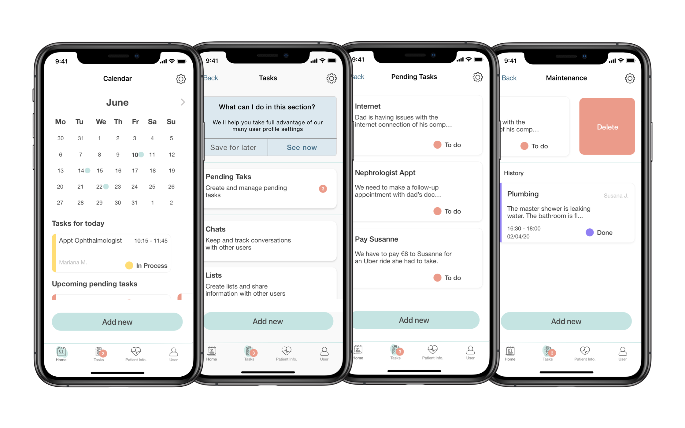
A mid fidelity prototype was then created to further test ideas and flows, it was then polished to a near high fidelity level so a to save on future time.
III.
Visual Identity
Keeping in mind the sensitive and highly emotional nature of the app we opted to create a visual identity that felt light and ethereal. We wanted our users to feel a sense of calm and security when usein the app, as if they were meditating in front of an ocean.
Typography & Colour
As far as typography is concerned I decided it was best to keep it to one font family, so as to not overwhelm the interface and the user. Tests were made with different fonts and Helvetica Neue was chosen for its legibility, standard size and comfort.
The colors palette was chosen with accessibility in mind. Each combination was tested, the result of which is the final selection.
Pastels were chosen after people suffering from daltonism expressed their preference for those colors as they could understand the hues better. It also proved to be very calming and friendly.
The red, yellow and purple tones were picked out for their distinctiveness and friendliness. I chose lively tones that would contrast well with the pastels but were not too yarring for the overall feel of the app.
Lastly blue was chosen as a secondary color for the subsections within the app, the “how to’s” and pop up messages to separate them from the main actions which would be in the main colors.
Grid
The grid chosen was an 8pt grid to help keep the design aligned, spaced and clean; and to make it easier for programers to work with.
User Flow - Advancing a Task
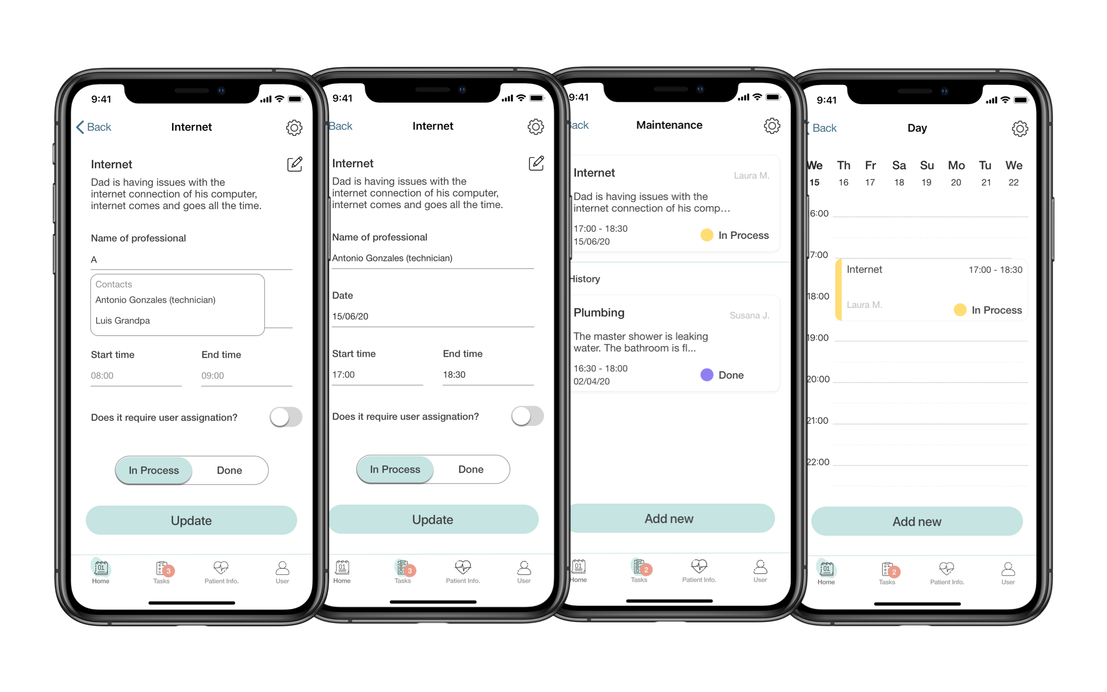
The app works with a simple color coding accompanied by text to maximize accessibility. This was tested with a combination of words and colors to see which ones best encompassed the meaning of the action. Based on the kanban method of categorizing tasks I chose to keep it simple and divide it into three status types. The “To do” status that signifies a task needs to be taken care of such as “we need to set an appointment with the dentist”; the “In Process” status that shows an action was taken to move that task along such as “the appointment was set” and the “Done” status which serves as a reminder the action was completed successfully.
Here is a very basic user flow within the app to show how a user would successfully turn a “To do” into a “In Process” status.
Onboarding
Because the app would carry sensitive information and will be, presumably, used mainly by the 50+ year old users I considered it important to provide them with a clear onboarding upon first use as well as a safe sign in method. I opted for clear language as well as clear directions to minimize problems they could encounter.
Saving Credit Card Information
The functionality of being able to sabve credit card information and addresses is simple: it alows our users to save time and compleate tasks faster.
User Profiles & Emergency Contacts
Within the app there will be different access profiles for the family to best control the information each member can access. This, again, came out of the research that showed a deep concern by the families that the people being taken care of might feel distressed after realising their care has a certain cost or generates a certain friction.
This modality also accommodates for non-family contacts such as, for example, a carer who might need to know when a medicine needs to be taken but not necessarily have access to the saved credit cards, addresses or other sensitive information.
Adding Medications & Alerts
WeCare bein a helth oriented app we had to design the functionality of adding new medications. Because most users would be on the older side we decided to give our users the opportunity to add as much detail as they needed to ensure the right medictaion was taken at the right time.
Another key feature of the app is that it would provide its users with customizable notifications. To give an example this means they’ll be able to decide whether or not they want to be notified of a successful medicine intake or a supermarket delivery.
Patient Card & Emergency Protocol
The main advantage of using WeCare to help with the care of a loved one is the emergency protocol it offers.
Once the admin users have completed the set up of their emergency protocol the app will generate a “Patient Card” to be displayed should the emergency signal be activated. This card, aimed mainly to facilitate information to passer byes and first responders, will display all the information deemed essential by the admins: physical information, pathologies, medications, allergies and preferred contacts. Should there be a preferred hospital saved into the app, a map will help locate it.
Another essential feature of the emergency protocol is the audio recording setting. Users can specify if they want the app to record the audio once the emergency signal is activated, for how long and who will have access to it. This can be especially helpful if the person activating the signal can not write to explain what is happening, if they are feeling faint and fear loss of consciousness or if the person activating the signal has to perform CPR (or similar techniques) and cannot be at the phone.
IV.
Looking Forward
Because the target audience is more prone to suffer from visual or auditory afflictions, the furute of WeCare is one of greater accesibility, to be able to adapt to best suit all its users.


