Traficantes de Sueños
I.
Understanding the Context
I was asked, alongside two fellow students, to redesign and create a Mid-Fidelity prototype of an existing website to improve it’s information structure and user flow. The groups were then changed and we were asked to create a matching app that would allow the business to increase its market value and capture new customers. We had to conduct both the UX and the UI research having one week for each one. Once the projects were finished, alongside one of my colleagues, we decided to take the UI of the app and apply it to the website, off curriculum, to test and challenge ourselves a little bit more.
Traficantes de Sueños
The key for these two projects was understanding the business we were working for, as well as translating its essence to our new proposal. We were given free range to redesign the brand style guide but had to keep faithful to its values.
Traficantes de sueños (or dream traffickers) is a bookshop with a very strong and established following as well as focus points. They provide various in-shop activities as well having their own publishing house with a social activism undertone. The possibilities proved endless when it came to this bookshop.
Competitive Analysis
With the aim of satisfying the needs of customers and arriving at a better solution, different apps that are positioned in the market were analyzed.
“I love going to cultural events. My mum is a journalist so I usually hear about them through her, although I do sometimes hear about events from the bookshops themselves of from the cultural centers I usually go to.""
Insights from the Interviews
1) There is an excess of information that confused the users
2) The search bar proved to be confusing, overly sensitive to misspellings and sis not provide possible suggestions
3) Most users found the overall look of the website to be "messy"
4) The great majority of users wanted a more curated set of suggestions & easier access to information regarding events.
How Might We Statements
How might we
help guide the users so they accomplish their goal faster?
How might we
help Traficantes de Sueños stand out from their competitors and be chosen by an increasingly fast delivery/online shopping customer base?
How might we
give Traficantes de Sueños a cohesive, inviting new design whilst keeping to their brand identity?
How might we
highlight their own publications and events making an app download worth it?
Features & Improvements
1) Higher focuse on the e-commerce aspect of the bookshop
2) Intuitive search engine that provides aide to the users
3) A cohesive visual identity that suits the book e-xommerce aesthetic
4) Book recommendations & Featured books as a way to capture customer's attention and highlight own publications
II.
Wireframing & Iterating
This part involved a lot of trial and error, testing ideas and making sure our users could complete their task properly and uneventfully. For our flow we chose a simple book purchase as this is the website’s the main purpose and the business’ main revenue source.
After several tests with the mid-fidelity prototype we finally arrived to the final product on which we would build for our personal UI project.
The website being done… we now had to turn all that information into a user driven e-commerce app but before we could begin the wireframing process for the app we had to understand how the information needed to be structured. This meant card sorting and site mapping.
III.
Visual Identity
To keep with the bookshop’s fresh vibe we decided to include illustrations as well as playful placeholder texts that had a literary allusion. We thought making the UI feel young, fresh and engaging was paramount, as was keeping it minimalistic so as to not clash too much with the busy nature of an e-commerce.
Typography & Colour
For the fonts we tested several variations both for text as well as logo and ended up decanting for Bodoni and Helvetica Neue. The former one for its elegance and literature reminiscent look and the latter one for its readability and light formality.
For the color pallete we thought best to focus on one of the many colors used in the website so as to not overwhelm the feed. Keeping in mind that book covers would provide the main color points we thought it best to keep our primary color almost exclusively for the calls to action within the app.
After a deep analysis of the brand colors we found a burnt orange to be the most effective for our app as it was strong enough it matched the essence of the business, yet not so harsh it would clash with the book covers.
Web Redesign
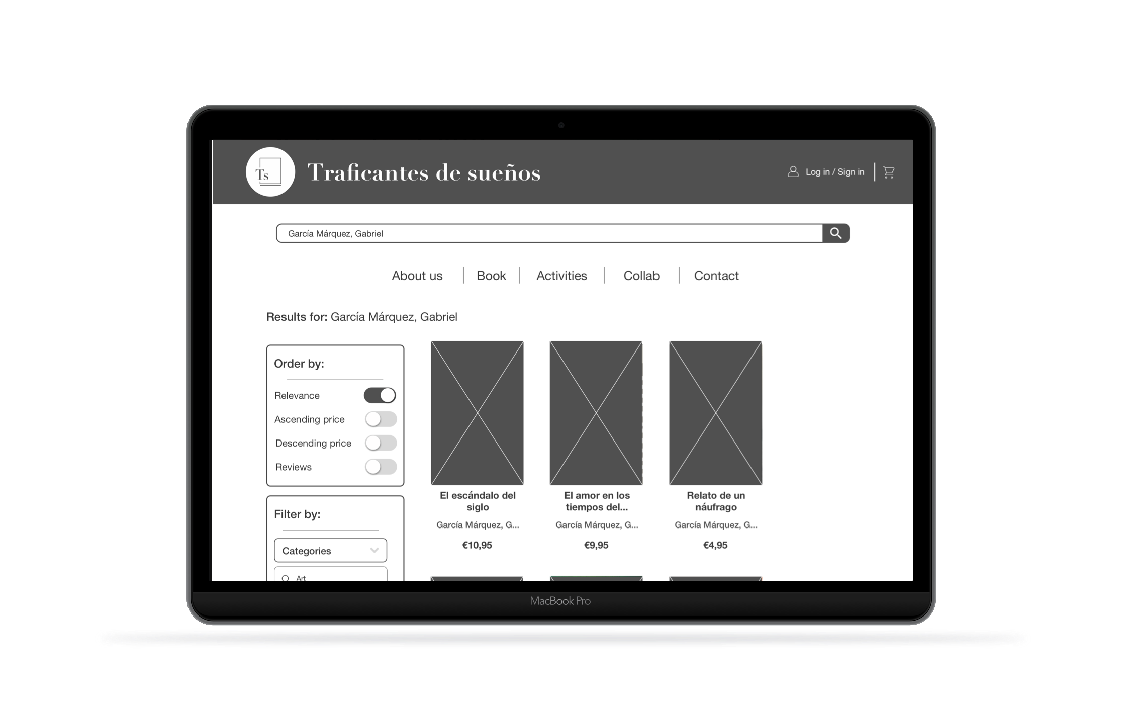
As above mentioned we cleaned up the UI by minimizing the use of secondary and tertiary colors and unifying card sizes and grouping books more intuitively.
Purchasing a Book
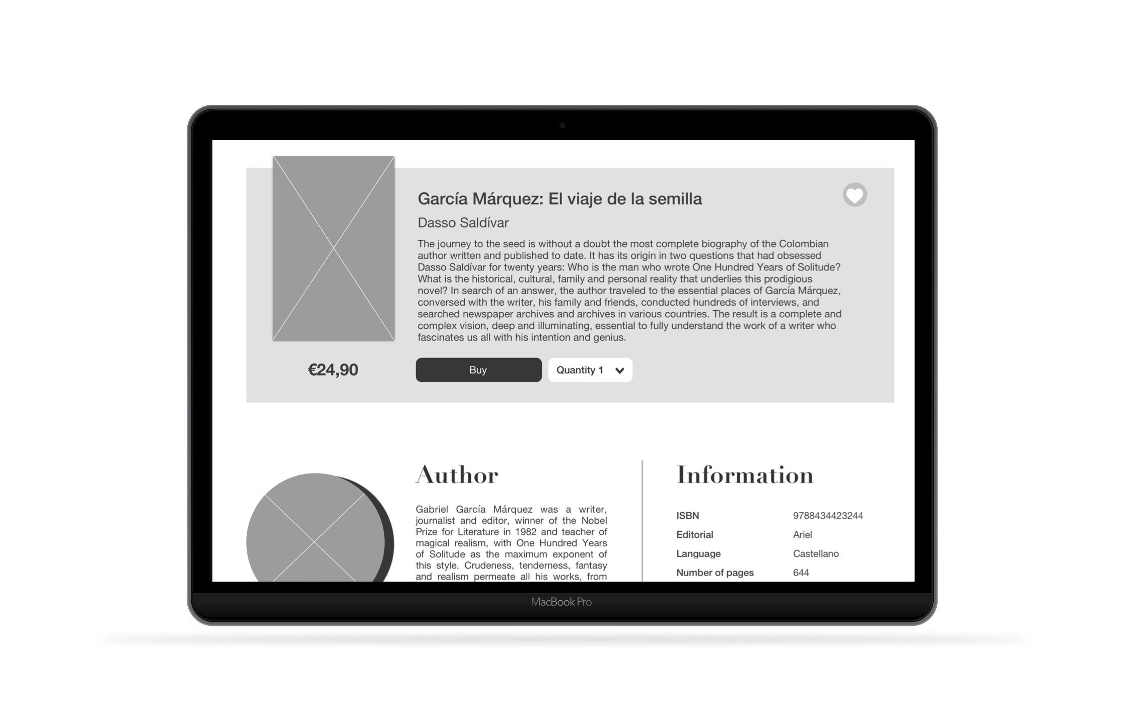
As far as the book pages and the purchase flow we decided to give more breathing space to the text and to highlight the inviting images of both the cover and the autor.
As far as the flow was concerned we decided giving a step by step journey for the user was key, cleaning up the UI and avoiding unnecessary information to prevent users from abandoning the task. We also provided an intuitive delivery service option as well as the possibility of saving information for future use.
Onboarding & User Creation
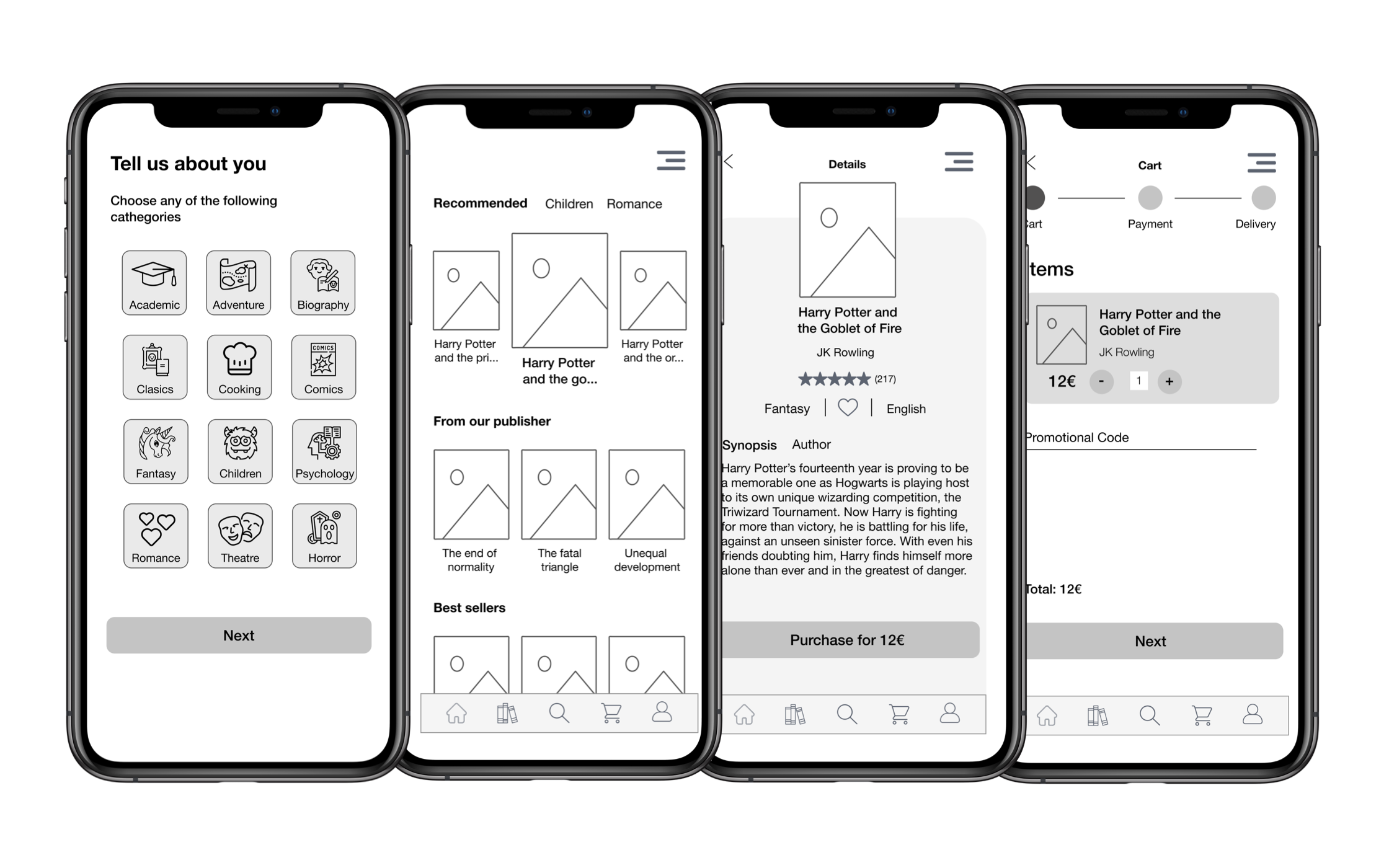
We thought that to make sure our users knew traficantes isn’t just a regular bookshop but a gem filled with courses, seminars and opinion pieces, we had to guide them upon first download with a comprehensive onboarding.
Preferences Functionality
Another key feature we wanted to add was that of a customizable preference board that would allow us to provide our user with tailored recommendations.
Purchasing a Book
For the app we decided to adopt the same process of the web but adapting it to the size and requirements of an app.
Shopping Cart Detail
Here is a detailed view of both the book card as well as the shopping cart.
We wanted to keep a cohesive visual identity that would work well on both the website and the app to provide users a sense of continuity, community and belonging.
IV.
Conclusion
Recreating a visual identity is no small feat and doing all this work in the span of two weeks wasn’t easy. It required a lot of teamwork, time management and target orientated planning. I found working for a brand as interesting as Traficantes de Sueños to be inspiring and truly fascinating as was working with an amazing team of creative and hard working minds.


