AH!
I.
Understanding the Context
AH! was born from the need to talk and explore our sexuality more freely. It was born from countless conversations about what we wished we had known, what we are afraid to be missing out on.
AH! looks to help break taboos and encourage users to discover themselves through pleasure.
Affinity Diagram
An Affinity Diagram helps us digest all the information gathered through the interviews, this in turn helps us identify the main pain points and overall issues whilst still keeping in mind the smaller, more nuanced problems our future users are having. It also helps us identify the emotional impulse that drives our users, what they want and what they need. Their core in a way.
“When we were kids we didn’t really talk about gender identity and sexual orientation, nor about sexuality. Talking about women’s pleassure is still stigmatized, the same goes for men in a way… there are a lot of topics men just don’t talk about regarding their sexuality”
How Might We Statements
How might we
provide our users with exercises for them to try on themselves and their partners, to help solve possible issues they might be having?
How might we
create a safe space that is welcoming to people of different ages, genders, sexual orientations, races and cultural backgrounds. How might we make the app feel personal and judgement free?
How might we
help users keep on track with the exercises and encourage their exploration?
How might we
offer trustworthy information that offers both a variety of perspectives and opinions?
II.
Wireframing & Iterating
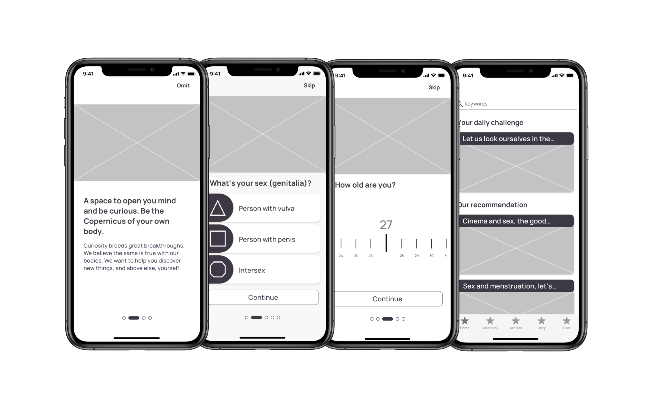
A wireframe was designed to create a basic structure and test the information architecture. The first iteration of the wireframe was made on a low fidelity capacity to test first concepts and ideas quickly and without paying too much attention to the UI.
A mid fidelity prototype was then created to further test ideas and flows, it was then polished to a near high fidelity level so a to save on future time.
III.
Visual Identity & Building Stones
There were some key limitations when tackling th UI of AH!. Creating the brand from the gorund up meant deciding every aspect of it, from colours to typography and illustration styles.
1) It couldn't be too graphic so as to not force an age limit on our users
2) It mustn't feel too serious nor childish
3) It must keep to a coherent look as it'd be an app with several functionalities and articles which can lead to a lack of uniformity and an chaotic look.
Typography & Colour
Manrope was chosen for the typography as it proved to be an easy to read, friendly and inviting font. Its rather curvy nature also seemed to match the overall feel of the app.
The colours palette was chosen with the topic of the app in mind. I knew it had to be playful yet grounded. Pinks and blues were discarded as they have social gender connotations that were too strong and clashed with the idea of an inclusive, gender fluid app. The same was decided regarding pastel tones.
We finally decided on purples for the primary color, as it felt both playful and trustworthy and it wasn't immediately associated to a specific gender. For secondary and tertiary colors we landed on a deep yellow and a pop cherry as they brightened the app, had a strong association with the content by the users and combined well with our primary purple
Grid
For the grid chosen was an 8pt grid to help keep the design aligned, spaced and clean; and to make it easier for programers to work with.
Illustrations
Illustrations where made on Photoshop using fruits and vegetables as inspiration and custom made watercolour pencils to give a more organic and playful look. It gave the app a distinctive feel and personality, different to it's competitors that favor photographs or line illustrations that veer somewhat to the "femenine" aesthetic the app tries to avoid.
All other illustrations found in the profile creation and onboarding screens were taken from the Open Doodles website after having tested variations using the in-app customised illustrations and having thought it best to make a distinction between the two thresholds.
Animations
For the animations within the app simplified versions of the illustrations where created using Principle to animate short gifs to be displayed when an exercise or an experience is registered successfully. This helped the users feel engaged and encouraged to keep on exploring the app
Iconography and Inclusiveness
A key component of AH! is it's inclusiveness and the adaptability of the app to it's user. It's because of this that the iconography used within the app was paramount and had to be well thought through.
For the first group of icons a set of rather geometric, simple forms were chosen as they have no prior connotation or relation to gender, sexuality, etc. This was decided upon the advice of professionals who favoured non descriptive iconography as to not alienate users when creating a profile that would ask a lot of private information from them.
The tab bar icons were more straight forward designes, the only exception being the "my body" icon which would change and adapt to the user's setting.
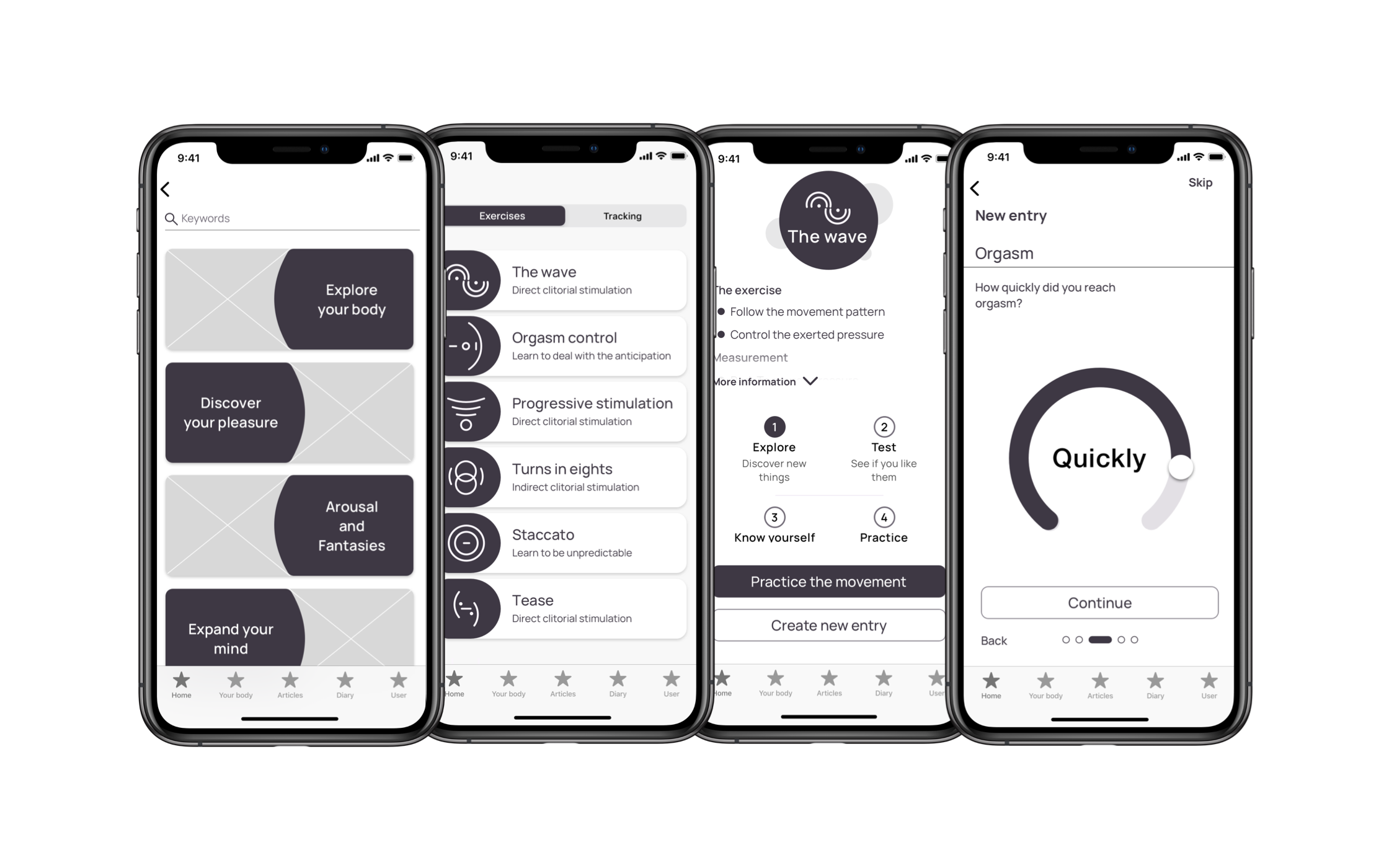
As far as the exercise icons are concerned, curves and movement alluding strokes were prioritised to not only reflect the patters of the specific exercise but also the proactiveness entailed in training and improving oneself.
Exercise Practice
One of the main functionalities of the app is that of being able to perform an exercise. The app would guide the user and let them know if they are following the pattern correctly, applying too little or too much pressure, etc. This will give the user a safe and discreet opportunity of getting the movements right before practicing them on their own bodies.
Tracking Exercises
After having practiced the movements on their bodies the users will be able to track their experiences and, eventually, see their progress. The tracking method was designed keeping the user in mind and after thorough investigation: interviewees expressed their interest in being able to track their experiences noting it had to be something that could be done quickly; whilst the interviews professionals mentioned these kinds of registers work best when the user is given set parameters.
Articles & Information
A desire and need of many users seamed to be finding trustworthy, varied and inclusive information. This was especially prominent in minority groups, teenagers and people over 50 years old. Thus a key component of AH! became ensuring people could browse freely and feel safe in their exploration.
The challenges are a functionality, fully customizable, to give our user a springboard to encourage discovery and increase the interaction with the app. Here is an example of one such exercise.
IV.
Conclusion
I believe design at its best allows users to transform themselves, to live an experience differently and see themselves in the product; to connect with it better. AH! became a special project as the more I research the more I realised just how much we need to open up channels for sexual education.
Be it hearing young people scared to ask questions they feared their surroundings would disapprove of or hearing older women who faced rediscovering her body post menopause and divorse, and how scared they felt; I’m proud of having created AH! and feeling like my mind opened with it.


